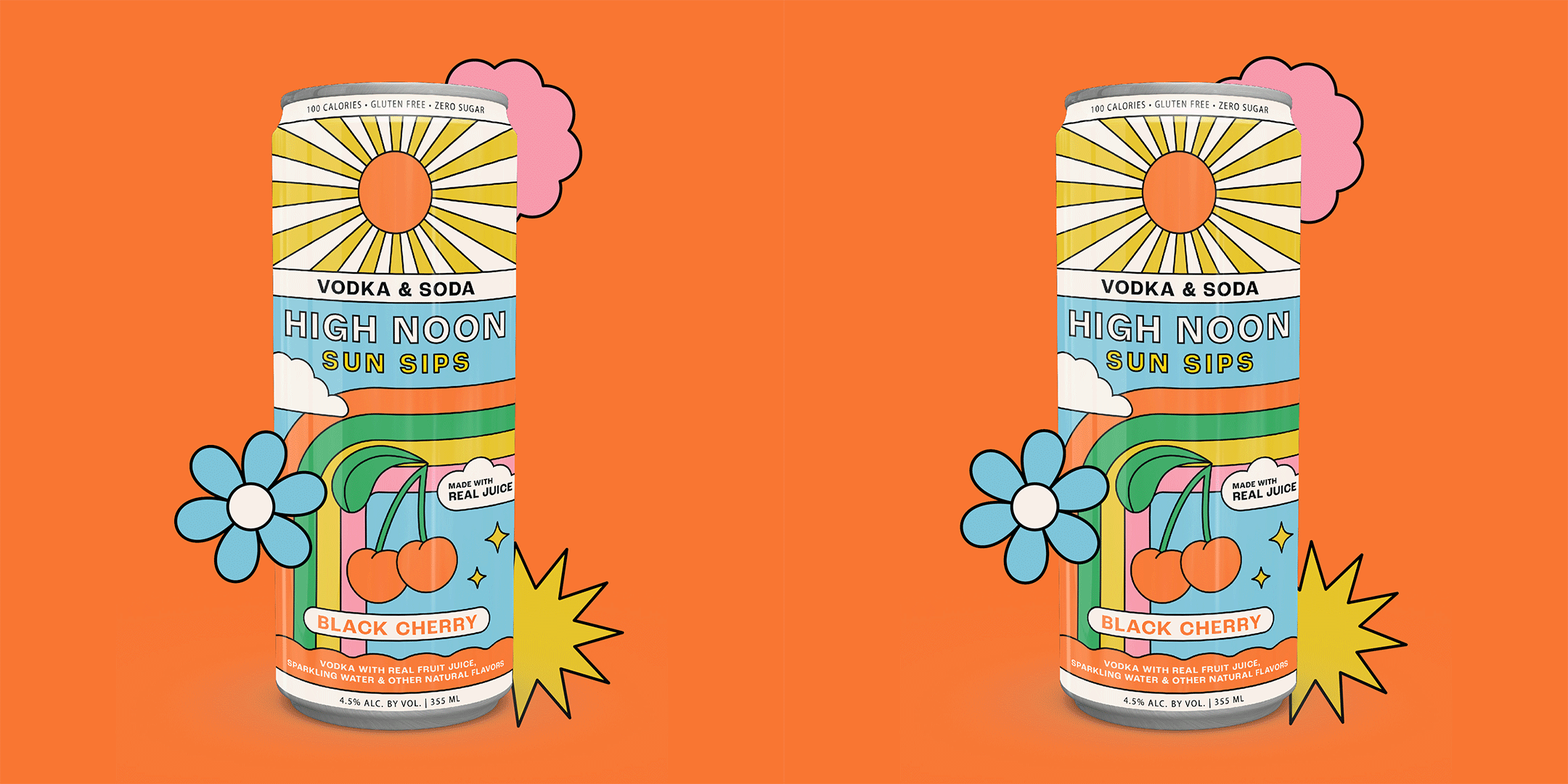
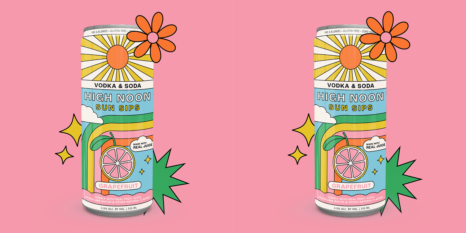
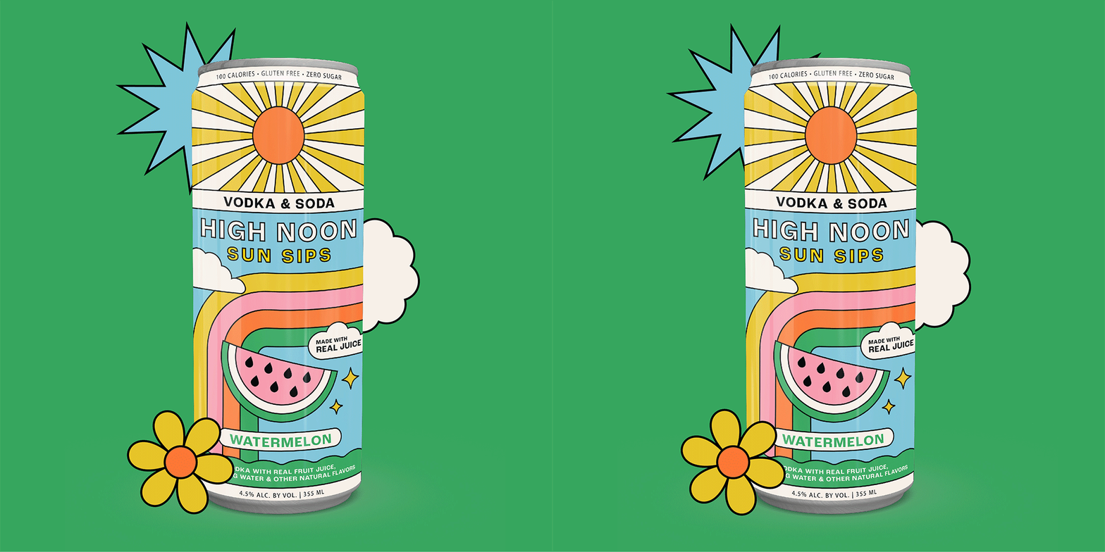
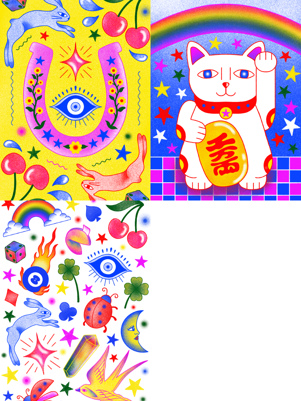
As a passion project, I took on the rebranding of the beverage company High Noon, exploring retro illustration to give its packaging a fresh, nostalgic feel while keeping its vibrant, summery vibe intact. I kept the iconic sun from the original design but reimagined it to fit within the retro aesthetic, adding new elements to bring the look together.
I envisioned myself as a High Noon consumer and imagined how fun it would be to carry packaging like this. I’m confident that the updated design would spark curiosity and conversation, helping the product stand out in a competitive market.
