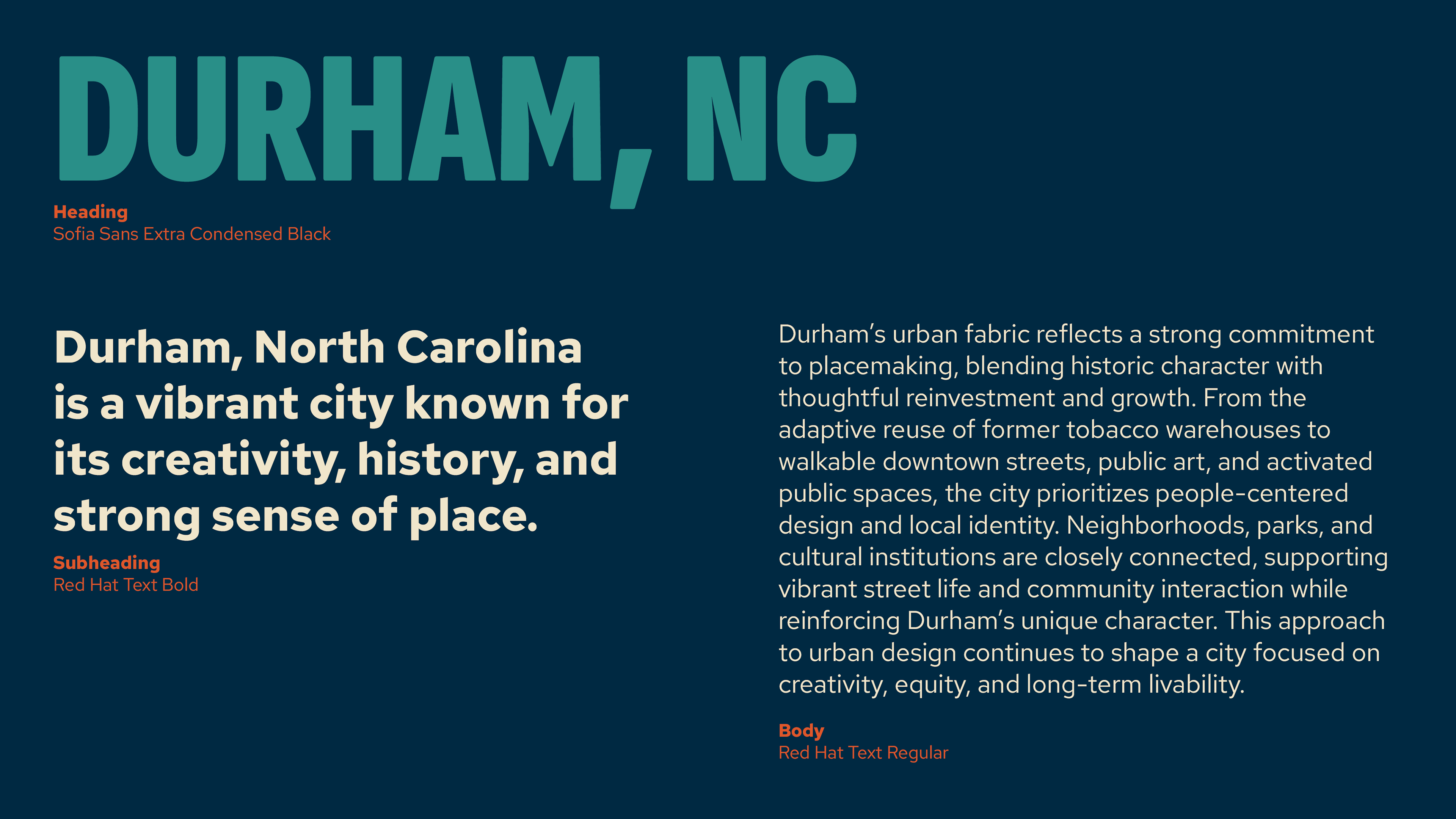
The Inspire Placemaking Collective rebrand focused on strengthening brand recognition while elevating the overall look and feel. The existing logo was refined rather than replaced, preserving familiarity while creating a more confident, contemporary identity. One of the primary goals was to better align the brand with the work they do, addressing feedback that the previous identity felt disconnected from the practice.
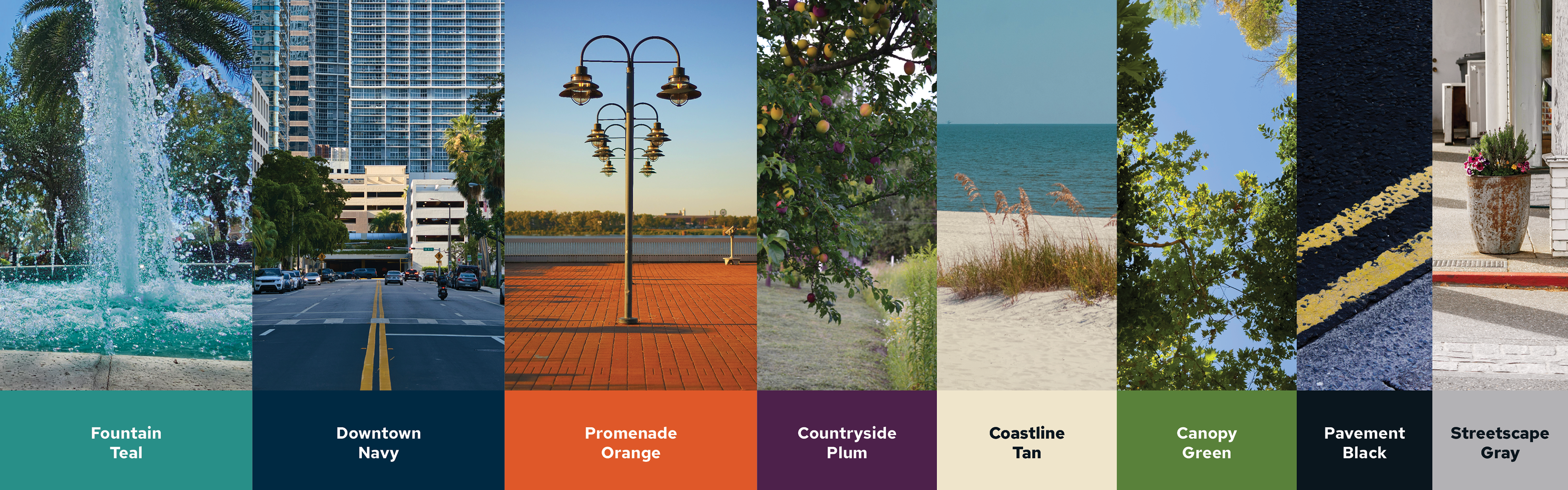
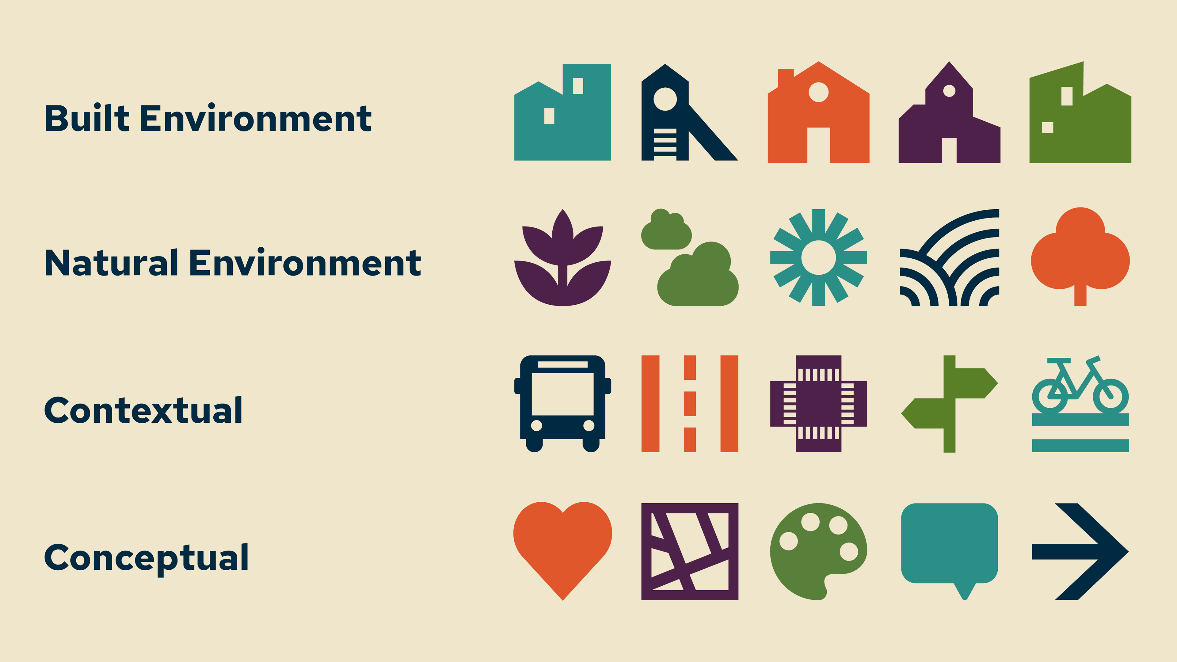
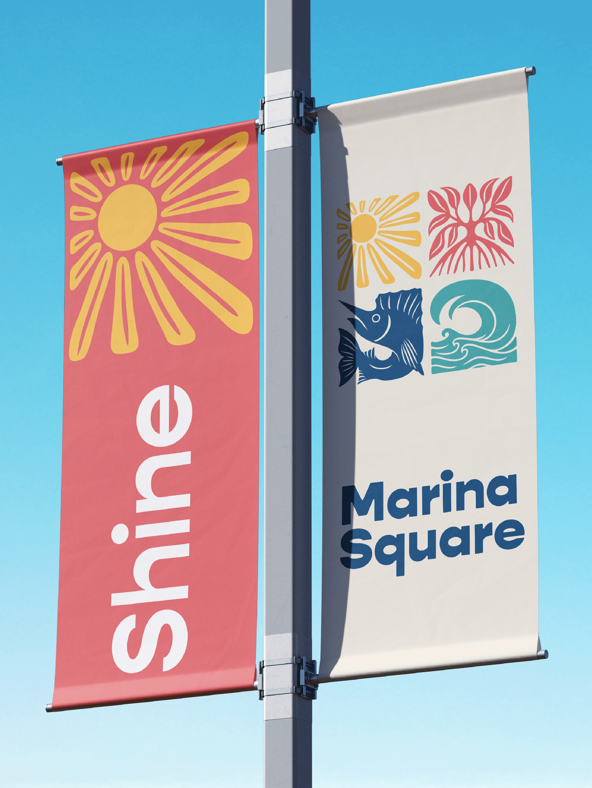
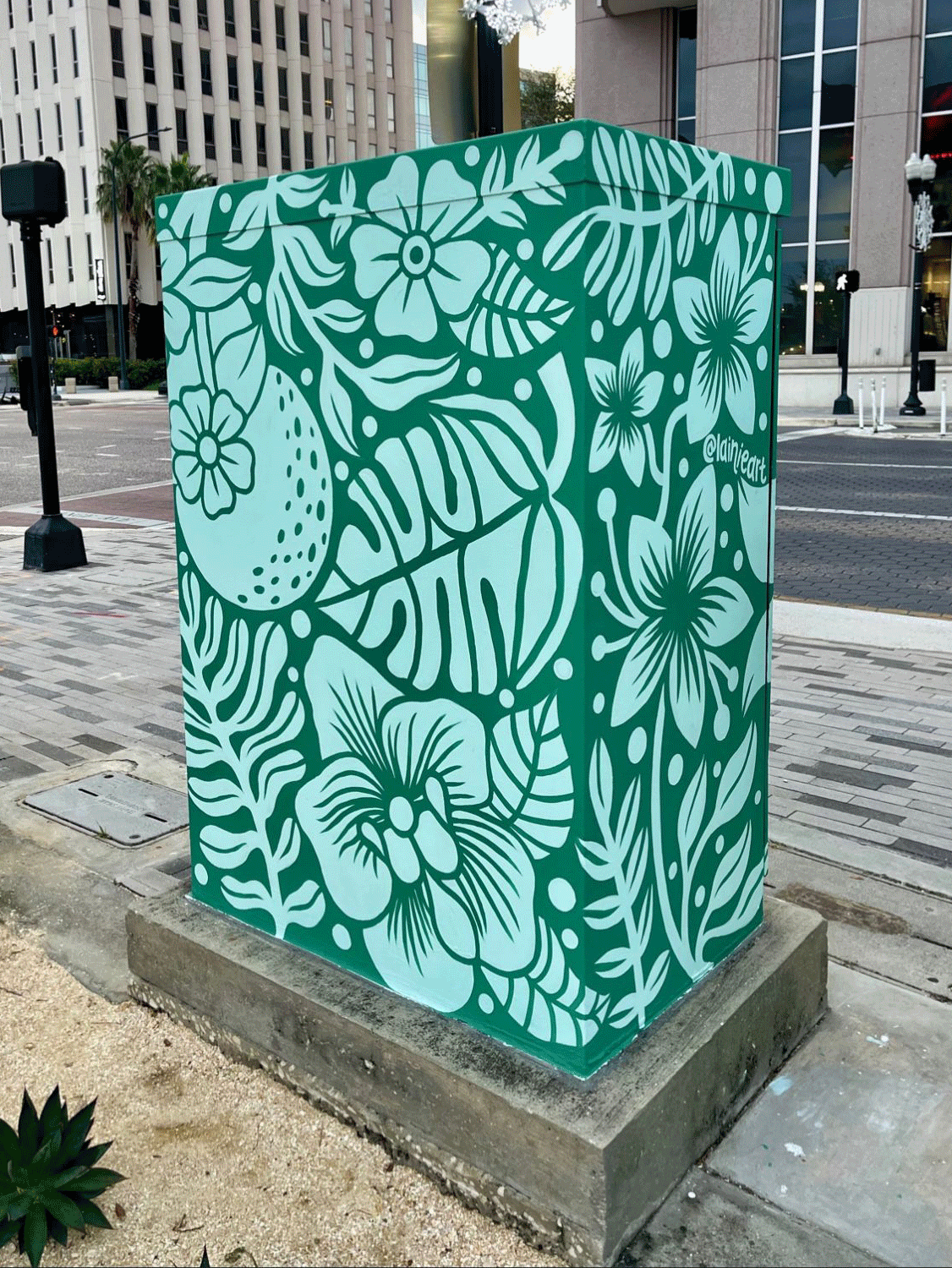
To support this, I developed a flexible icon system representing the many facets of Inspire's work, designed to be used across a wide range of applications. The color palette was also thoughtfully refined, drawing inspiration from the places we serve, such as vibrant downtowns, rural communities, and coastal cities alike. The result is a brand that feels inclusive and reflective of real places and people. Throughout the process, the goal was to strike a balance between being fun, energetic, and distinctive while still conveying credibility, professionalism, and expertise.