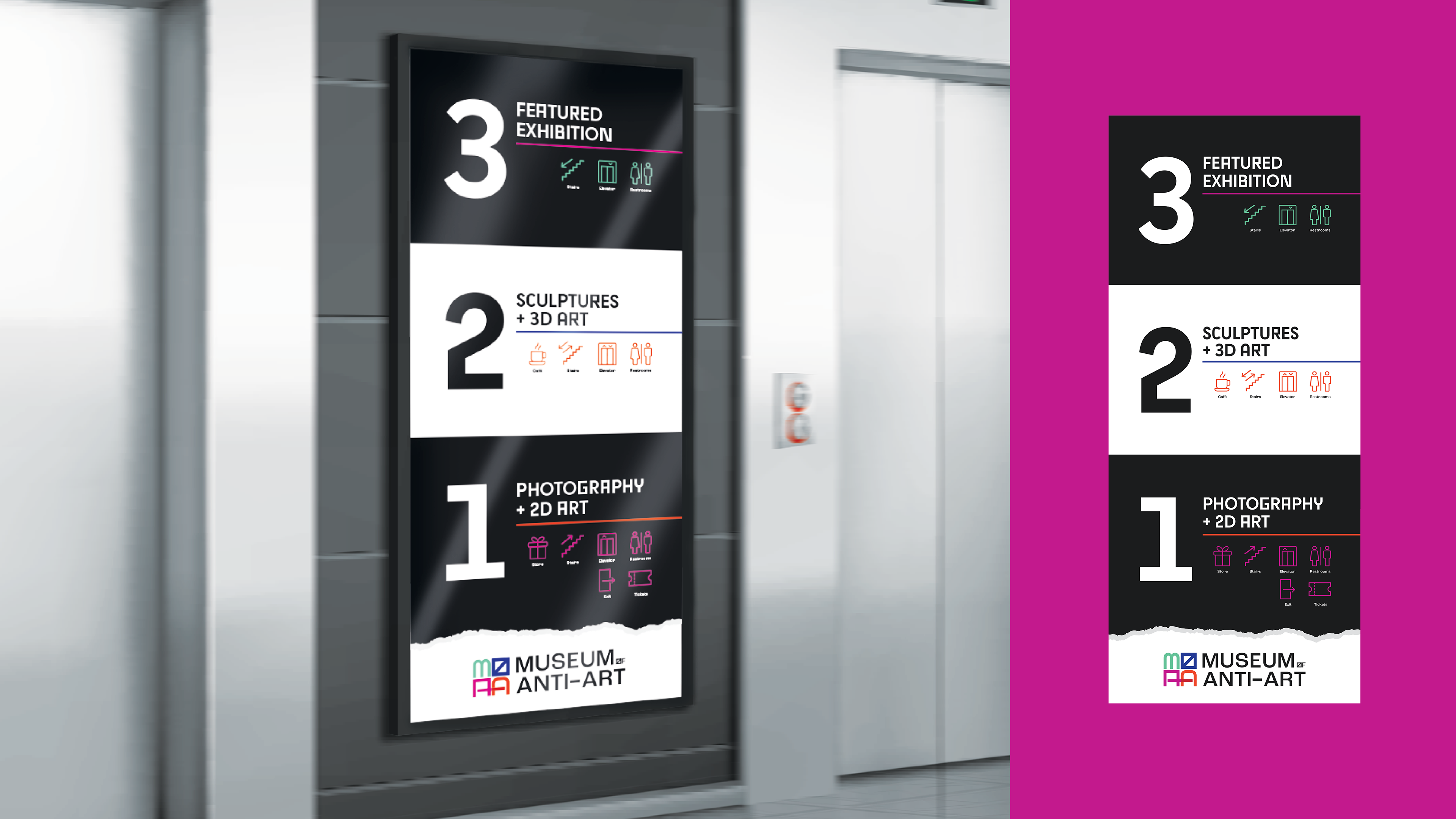
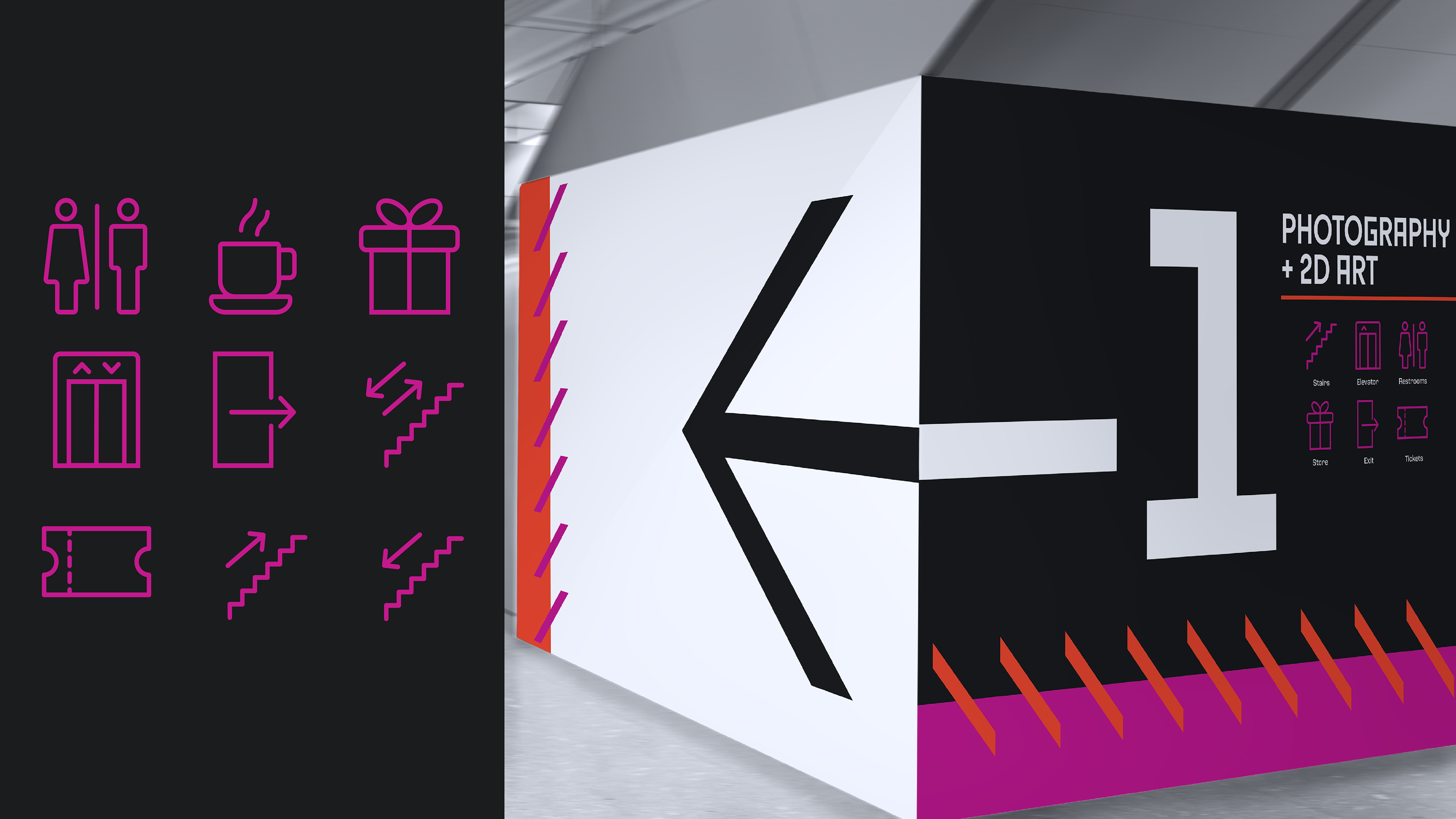
For this project, I wanted to create an art museum that pushed the limits on what art is and can be. As I was doing research on other modern art museums that exist, I found that the museums themselves really lacked a sense of voice and personality. I wanted to push the limits with my branding, just as the art inside of it pushes the limits as well. I wanted the brand to be an experience that is distinguishable from just any other modern art museum.
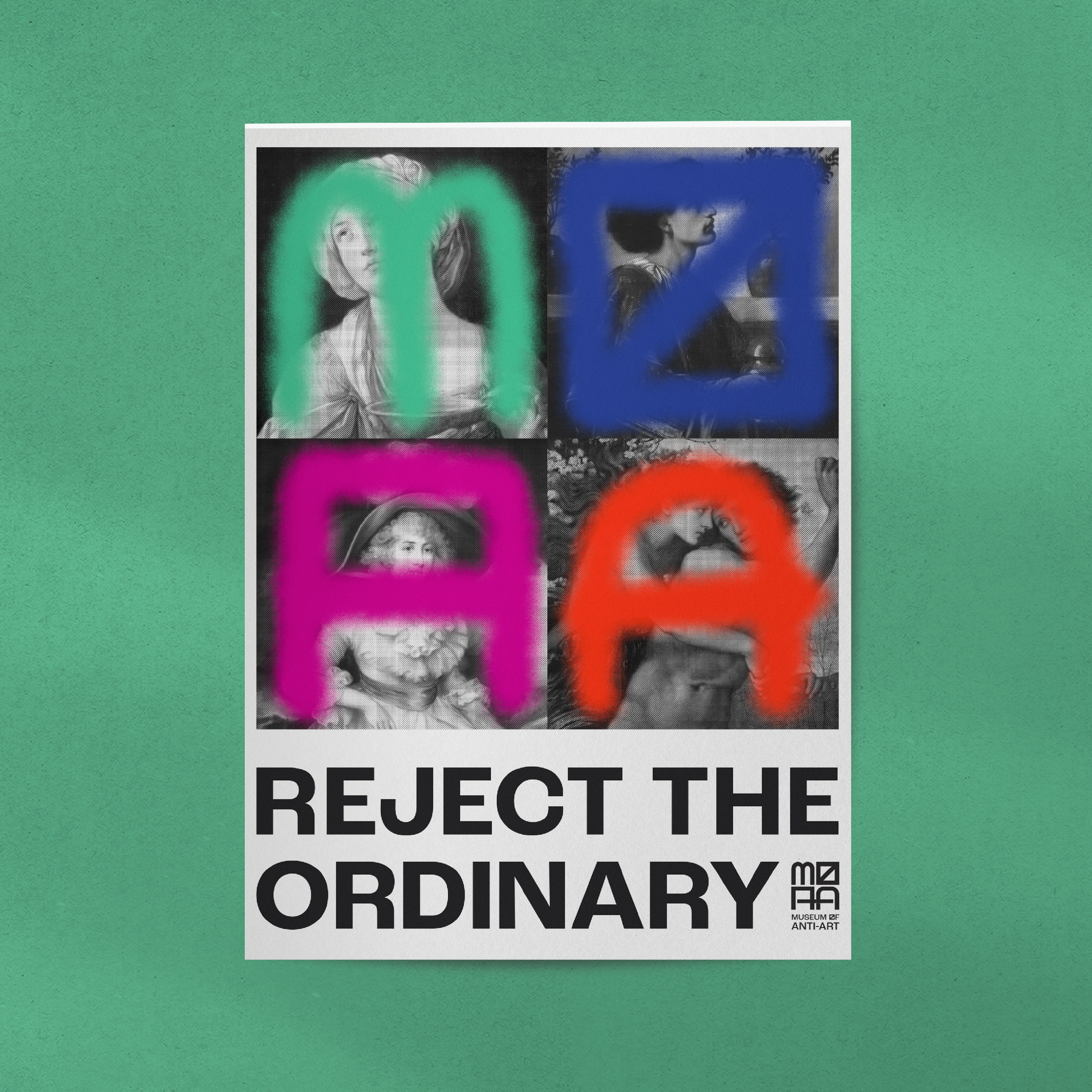
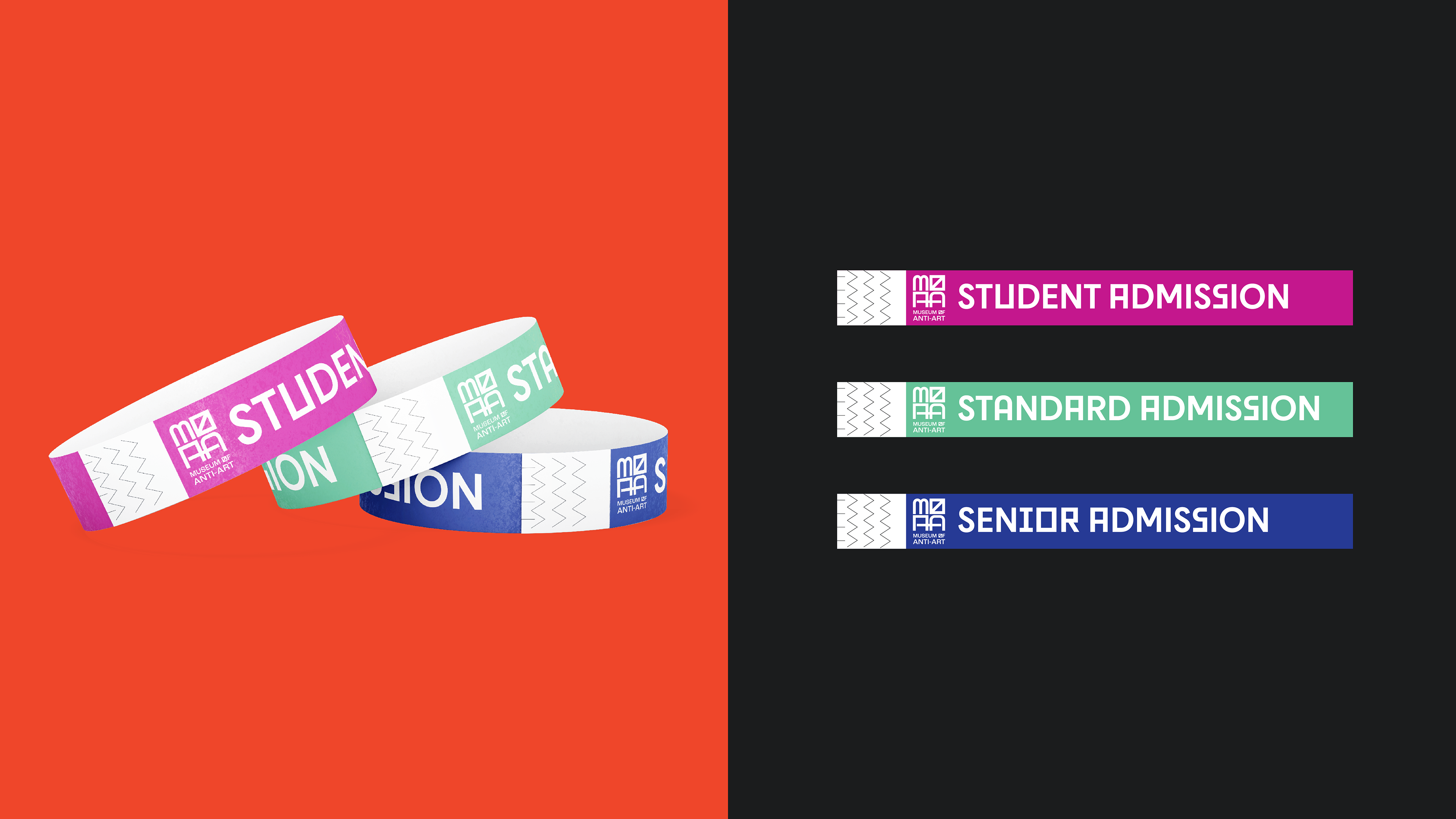
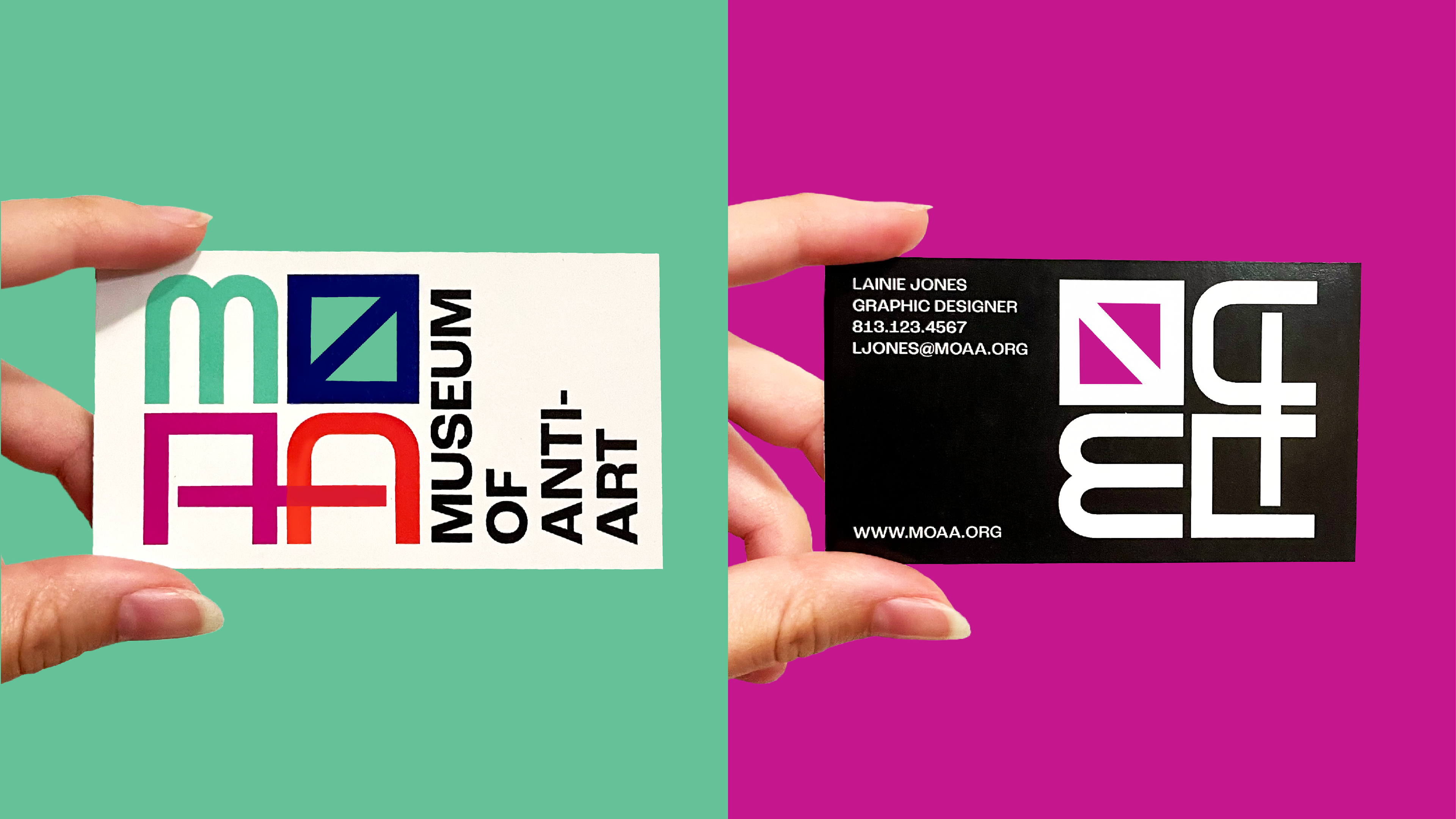
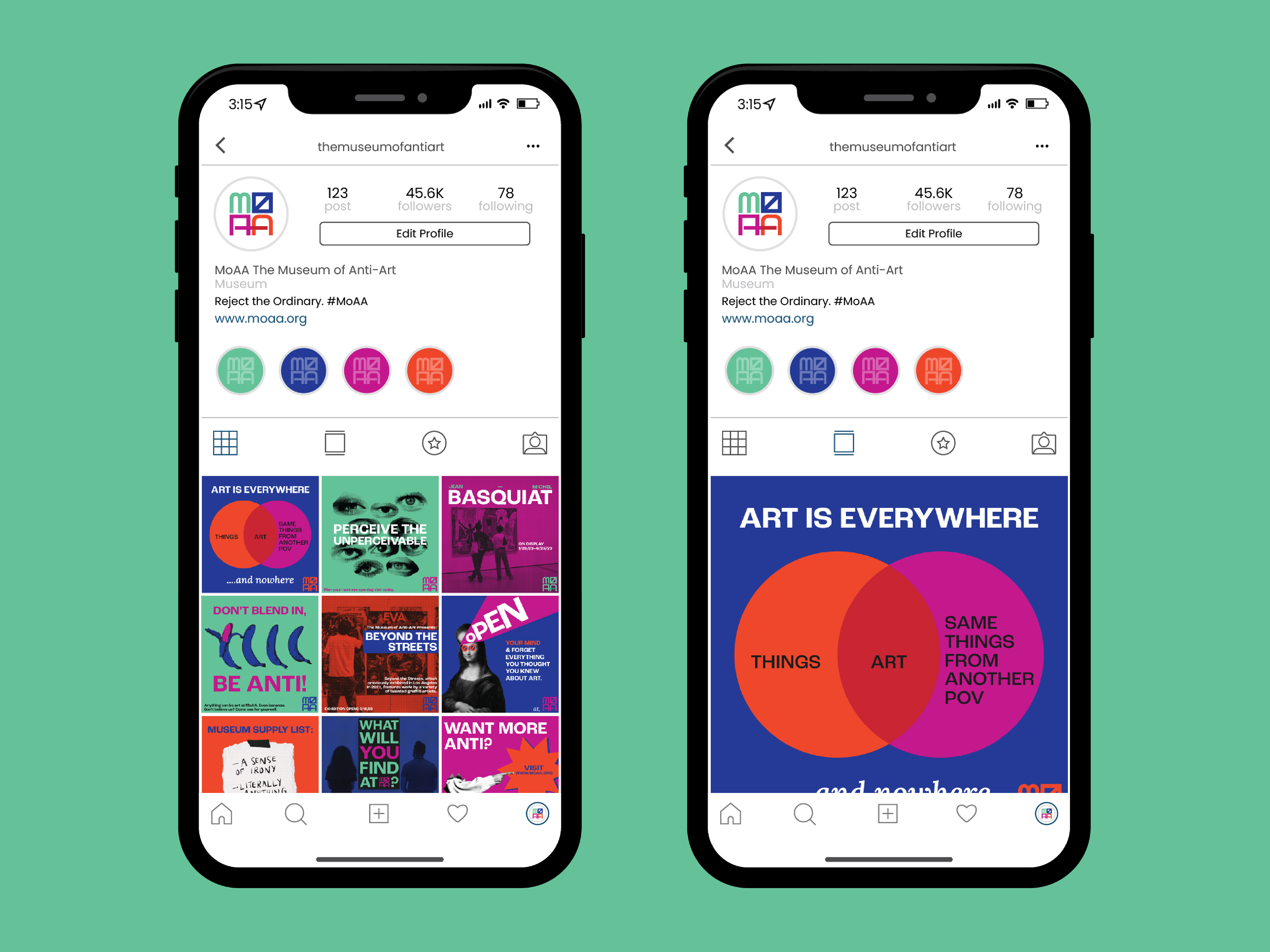
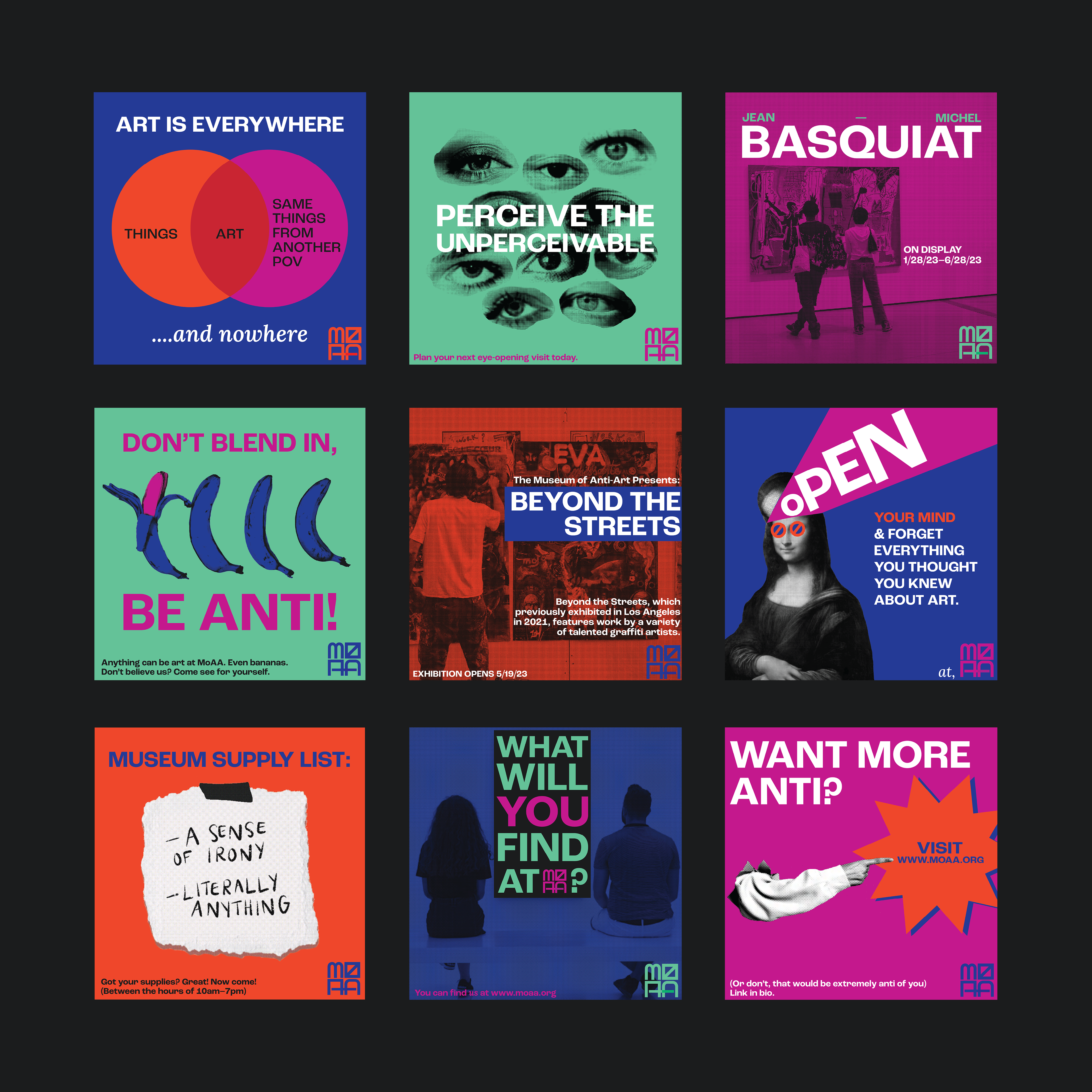
My brand consists of bold colors and shapes that contrast each other to further expand on the “anti” concept. I also often used images of classic pieces of art and added the brand’s own twist to them such as illustrating on top of them and changing the colors. I did this to show that the brand rejects the standard of what art is. I also gave my brand a strong sense of voice by adding a sense of irony, edginess and wit into the advertising, something that I feel is not often present in typical museum branding. My goal was for the museum goers to feel fully immersed and entertained, even when they are not directly looking at art.
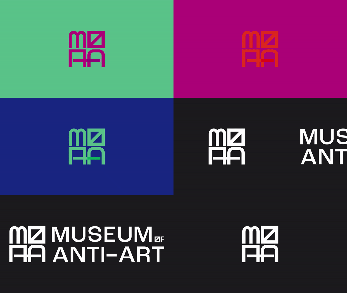
Logo Variations
Brand Materials


Social Media
Signage

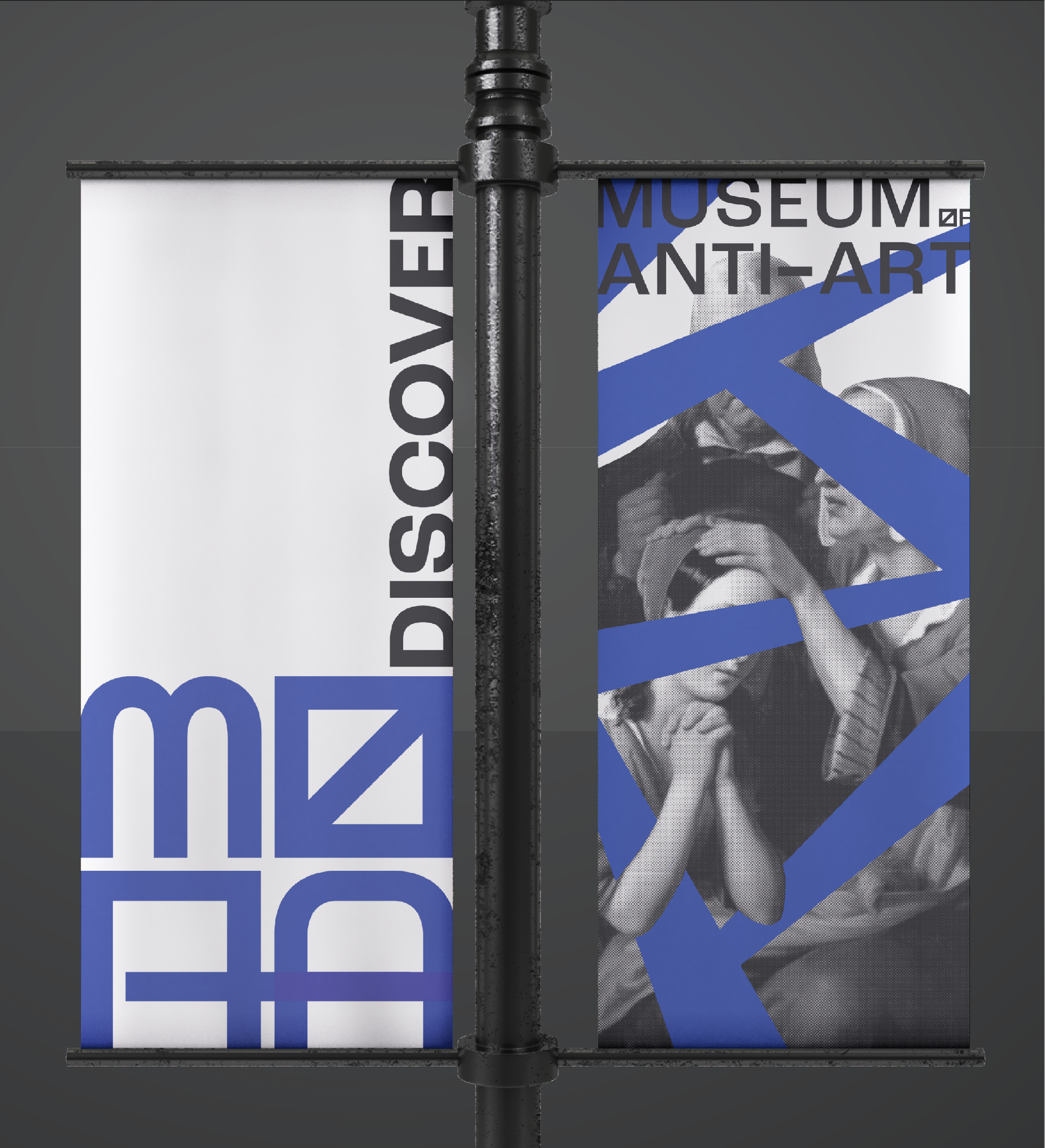
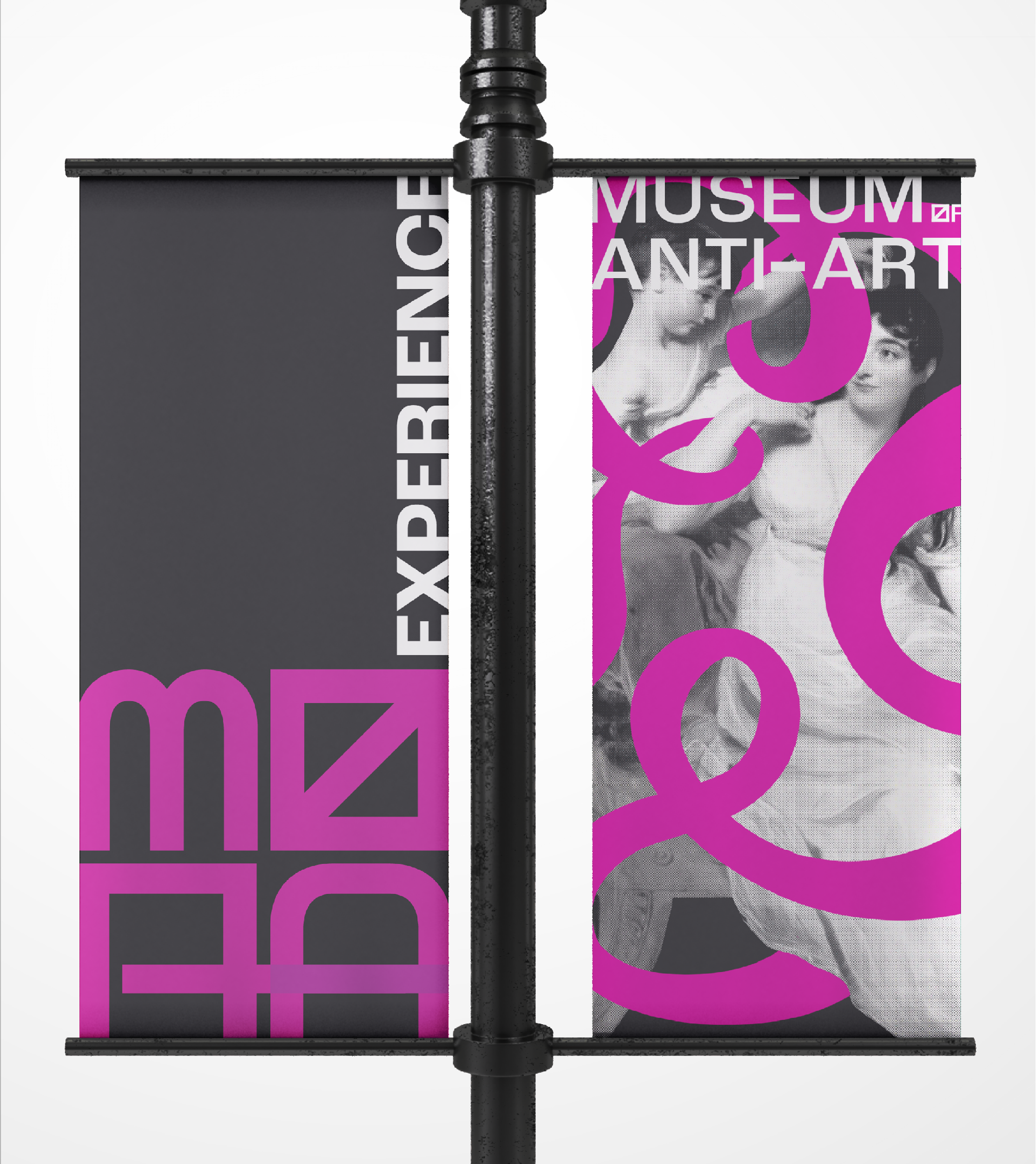
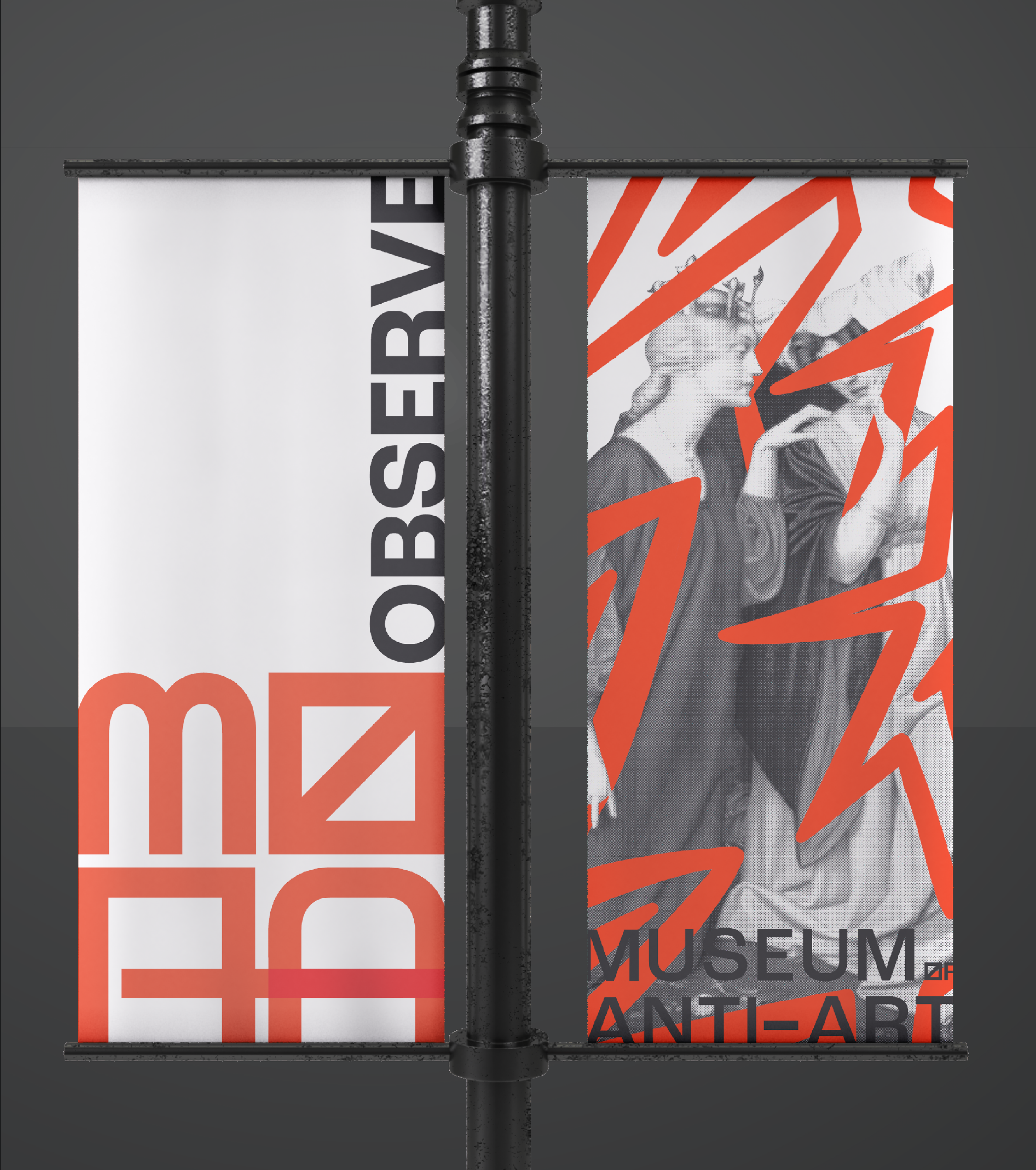

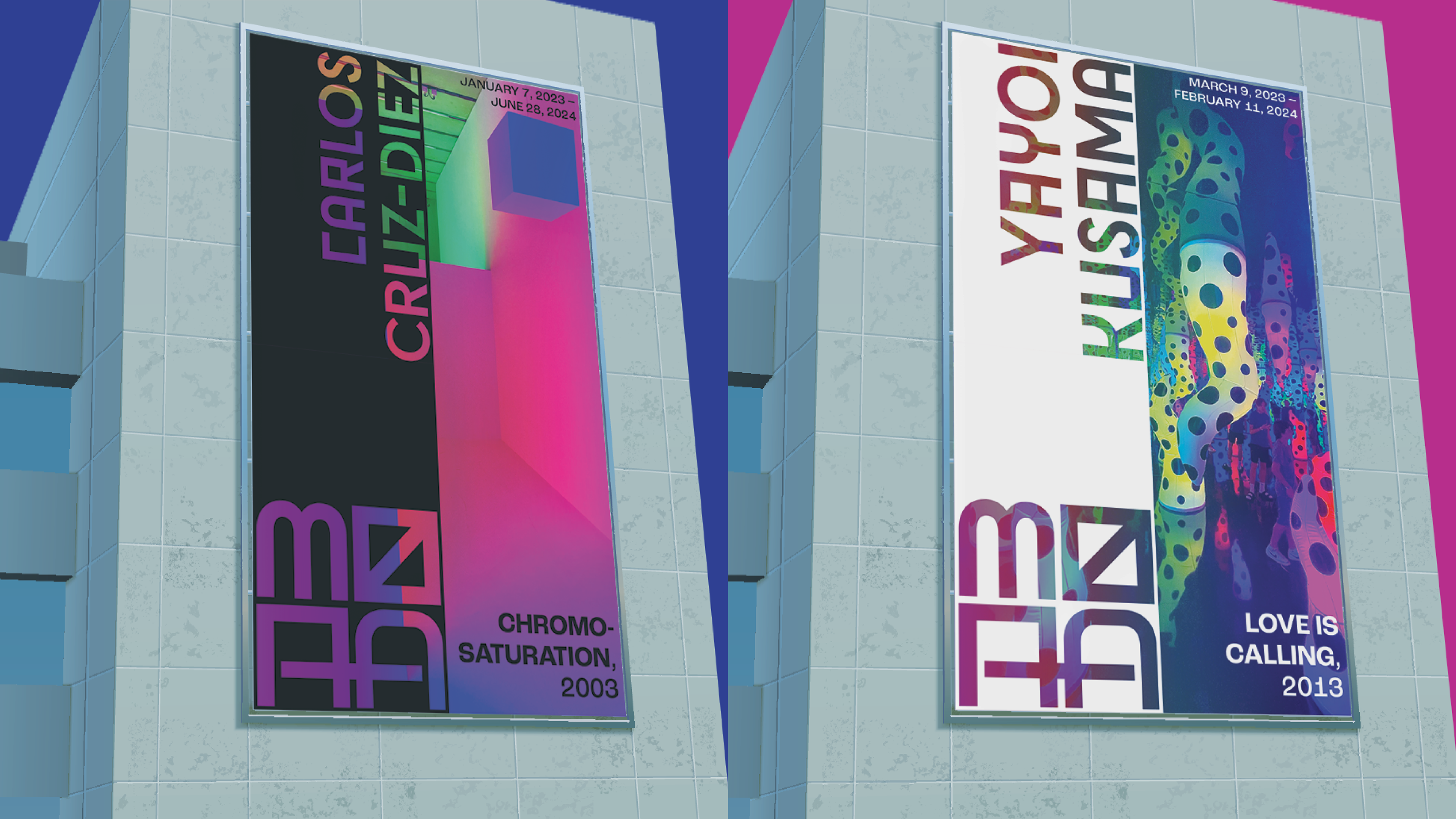
Wayfinding
